Millions of American homes transform into dazzling holiday spectacles each winter, echoing the chaotic cheer of classic films like Christmas Vacation. Yet designers emphasize that the line between festive delight and overwhelming clutter hinges on thoughtful curation rather than sheer volume.
The Foundation: Curation Over Quantity
Kerrie Kelly of Kerrie Kelly Studio notes, “Joy comes first, but curation amplifies joy.” When scale, color palette, and light temperature align, decorations appear intentional and cohesive. Bethany Adams of Bethany Adams Interiors adds, “Except for overly rude or crude decor, there is nothing that is inherently tacky. It’s all about how—and how much—you use it.” Professionals apply principles of composition and visual hierarchy to create elegant spaces that draw people in, avoiding the anxiety induced by excess.
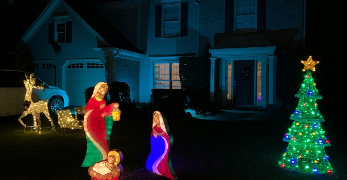
Kelly captures the essence: “When scale, palette, and light temperature work together, your favorite pieces read as intentional and cohesive rather than accidental.” Edit ruthlessly—subtraction fosters sophistication. Nostalgia has a place, as Adams shares her love for childhood colored lights, but confine it to one area like the family tree. Fewer, precise pieces elevate any display, letting architecture shine.
Nine Critical Mistakes to Avoid
Designers identify key pitfalls that undermine holiday displays:
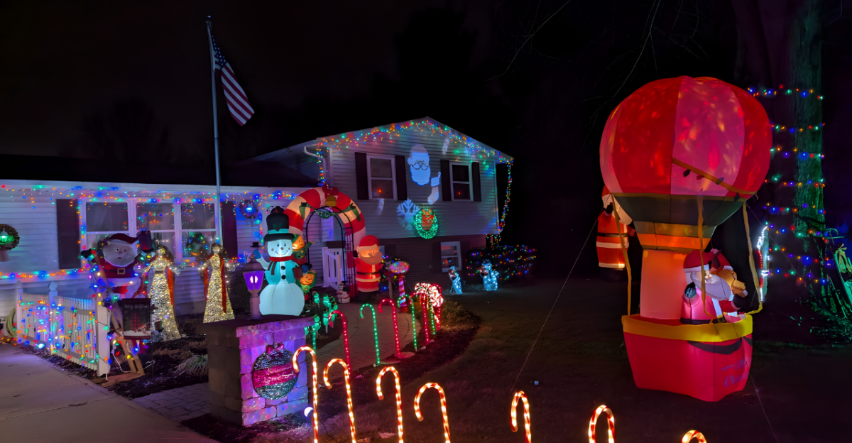
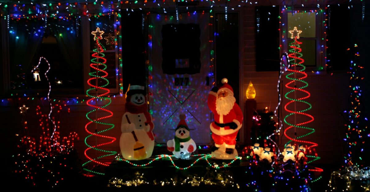
Multi-colored blinking lights create chaos, resembling a Vegas spectacle, per Katherine Aul Cervoni, founder of Staghorn NYC: “This ends up looking cheap and overwhelming.” Opt for static warm whites instead, as flashing triggers stress while steady glows promote calm.
Mixing themes breeds confusion. Adams invokes Coco Chanel’s rule: commit to one narrative, like icicle lights with greenery or inflatables alone, tailored to your home’s architecture.
Casually tossed net lights over shrubs look sloppy, like “a giant lit-up cheesecloth,” Cervoni says. Shape them to follow natural contours for a polished effect.
Cluttered mantel villages overwhelm; Kelly advises vignettes of three items with varied heights and breathing room to let eyes rest.
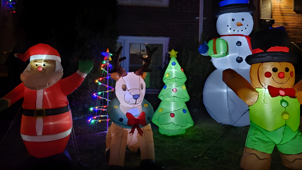
Excess inflatables obscure architecture. Kelly recommends one statement piece flanked by greens or lanterns: “One whimsical statement can feel charming; a whole brigade reads chaotic.”
Lights glaring into neighbors’ windows cause friction; use downward static washes or pathway lighting.
Heavy synthetic scents clash; Kelly suggests natural options like simmering citrus and cinnamon for subtlety.
Stiff plastic ribbons signal cheapness; swap for satin or velvet with wired loops for elegance.
Lingering post-February 1 decor screams abandonment, as Cervoni reiterates.
The Warm White Lighting Standard
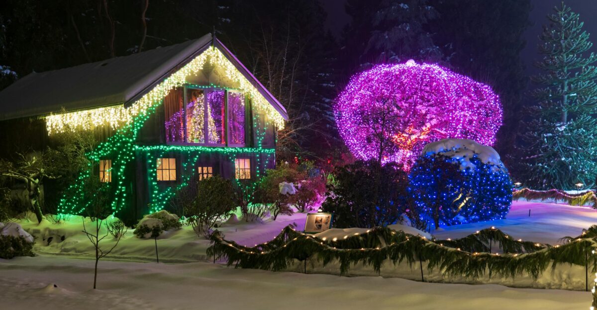
Unanimous consensus favors warm white LEDs at 2700K to 3000K, mimicking incandescent glows for intimacy. This unifies setups, making them appear luxurious. Cool whites feel clinical by contrast. When light temperature remains consistent across all displays, the entire presentation reads as sophisticated and professionally executed.
The February 1 Deadline: When Festive Becomes Forgotten
Experts set a firm outdoor decoration removal date: February 1. Cervoni warns, “you enter the tacky zone” if items linger beyond then. Faded, weathered displays signal neglect as winter yields to spring. Planning a takedown—complete with checklists, photos, and assigned helpers—ensures smooth execution and preserves neighborhood aesthetics.
Embracing restraint now promises holiday setups that endure as welcoming beacons through the season, fostering community harmony and setting a refined tone for the year ahead. Thoughtful planning averts common errors, ensuring displays amplify joy without excess.